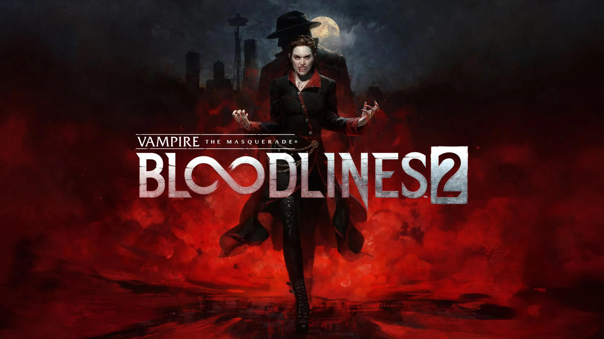
In the world of modern gaming, few topics spark as much debate as motion blur. With the release of Vampire: The Masquerade – Bloodlines 2, discussions around motion blur settings, realism, and visual comfort have reignited among players and designers alike.
But beyond the surface of gaming graphics, there’s something fascinating about this effect — something that connects directly to digital aesthetics, creativity, and even emotional expression.
Let’s explore what makes Bloodlines 2 motion blur so controversial, and what it can teach us about the art of visual perception — both in games and in design.
Motion blur is a visual effect that mimics the natural blurring our eyes perceive when objects move quickly. In Bloodlines 2, this effect is designed to make the game look more cinematic and immersive.
However, not everyone enjoys it. Many players have reported that motion blur in Bloodlines 2 can cause discomfort, eye strain, or a sense of “fuzziness” that detracts from gameplay clarity.
This leads to one of the most common searches around the game:
“How to disable motion blur in Bloodlines 2?”
In technical terms, players can often adjust or disable it via configuration files by setting commands like:
r.MotionBlurQuality=0
r.MotionBlur.Max=0
These lines, hidden deep in the game’s engine.ini file, have become symbols of player control over visual experience.
Blur is not just a technical effect — it’s a psychological one. Human eyes naturally seek sharpness and focus. When blur appears unexpectedly, it signals confusion or movement. In gaming, this can be exciting — or disorienting.
Interestingly, the same principle applies to text design and digital art. A blurred word or shape captures attention precisely because it denies instant recognition. It forces the viewer to engage emotionally before they understand rationally.
This is where Blurred Text Online enters the conversation.
Just as motion blur in Bloodlines 2 transforms realism into sensation, Blurred Text Online turns language into emotion. The tool allows users to create custom blurred typography — soft, mysterious, and beautifully unreadable.
Both techniques — one from gaming, one from digital art — explore the same question:
How much can you hide while still being understood?
In Bloodlines 2, blur enhances the illusion of movement.
In digital art, blur enhances the illusion of meaning.
They both speak to a world where perception is design.
Try it yourself: experiment with the boundaries of visibility and emotion using Blurred Text Online — where blur becomes beauty.
From an EEAT perspective, understanding motion blur is valuable not just for gamers but also for designers and creators. It teaches key lessons about:
This is why many digital creators use Blurred Text as a stylistic element — to convey emotion and depth without overwhelming the viewer.
The debate over Bloodlines 2 motion blur shows us something deeper: our craving for control over how we see. Some prefer crystal-clear visuals; others enjoy cinematic softness.
Whether you’re a gamer fine-tuning visual settings, or an artist experimenting with blurred text, the message is the same — clarity is not always beauty.
Explore that delicate balance between focus and fade at https://blurredtext.com/ — where blur becomes art.